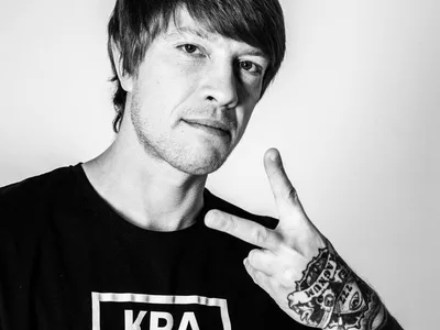
Today in our article, one of the talented realism tattoo artists of ProTeam КРАСКА Tattoo Ink - Vladimir Korolev will talk about applied experience with the use of the КРАСКА palette and share some secrets that will be useful to both novice artists and professionals.
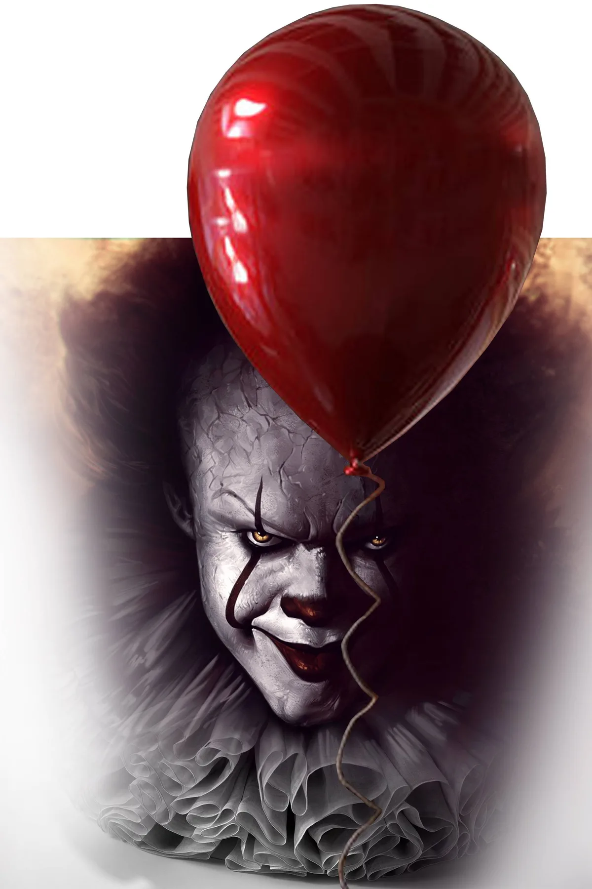
would like to start with the fact that this project is a customized version of popular artworks on the main anti-hero of the film "It" - Pennywise the Dancing Clown, created by one of the most talented writers of our time, Stephen King.
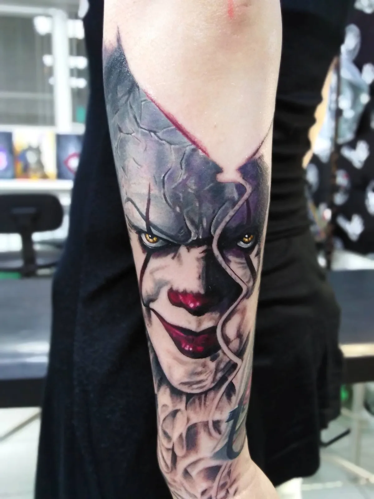
The client wanted this particular image, but on her hand were already present the works of other artists, so I needed to fit the clown into the whole picture.
Due to the popularity of this film, you can find quite a lot of artworks and screenshots with Pennywise on the Internet, in which he is depicted with open mouth, exposing his frightening, sharp teeth. However, one of the client’s wishes was the image of the clown with closed mouth.
Initially, the tattoo was supposed to be much smaller, which would not go beyond the elbow. But after we studied the whole arm and tried on several size options, I came to the conclusion that if all the images are limited by the elbow, this will break the overall composition of the sleeve. Therefore, we decided that part of this tattoo should go beyond elbow and thereby tie together all the other parts of the sleeve.
Also, for a more realistic image, I increased the size of the balloon, which, being located in the foreground of the image, should be larger than the head of a clown.
Combining all the parts of the sketch together, we got such an exclusive image.
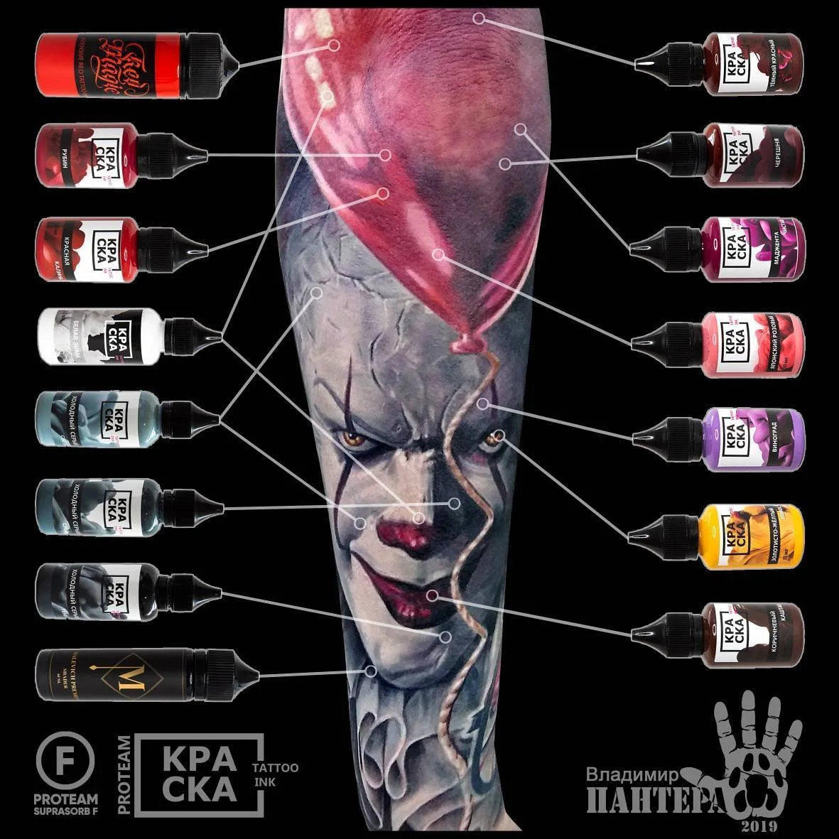
The concept of this work is based on a combination of cold and warm colors. This is the so-called color or tone contrast. The contrast is also might to be based on a combination of dark and light areas, it is also present here, but the basis is precisely the tone contrast.
Pennywise's face was painted in cool gray shades from the КРАСКА Tattoo Ink pallete, and the balloon was supposed to be made in a red warm palette. This combination made it possible to strongly contrast the balloon against the background.
In the first session, I made a marking with a thin contour needle and began to paint. To paint the face, as I wrote before, cold gray shades of the КРАСКА Tattoo Ink were used, which I mixed each other and added lilac reflections. Also in the first session, we made the eyes. This is my favorite part of every tattoo. And we made a nose and lips. Here, dark red shades were used in combination with black pigment to give additional contrast.
Working in the monochrome part of the image, I also needed to use the principles of light contrast to create the required volume. Where the highlight is light there, where the shadow is there are dark pigments. The light areas moves forward, the dark areas goes back. All this is the basis of academic drawing.
After we painted the whole face, painted the nose, eyes and lips, we made a rope and added a small shadow from the balloon to devide it from the background.

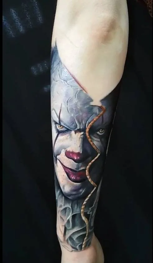
We made a separate session for painting the balloon, since the elbow is a rather difficult place to apply tattoo. I tried to place it so that no significant detail fell on the elbow. Here I used almost the entire palette of red shades the КРАСКА Tattoo Ink, starting not even from dark red, but from brown and ending with the lightest pink shades.
On photo you can see that the elbow did not heal as well as we wanted. There should have been an area of solid color, but after healing some spots appeared. This is one of the features of this part of the body that must be taken into account and you should plan an additional correction session for it.
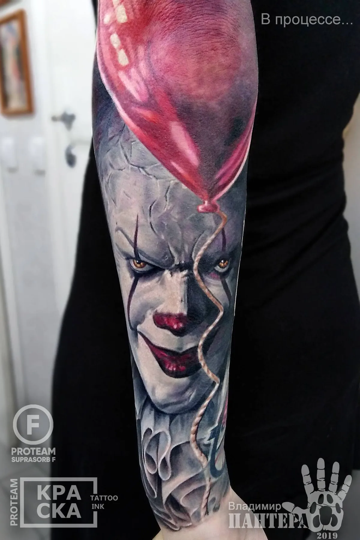
One of the main mistakes of artists who make Pennywise tattoos is that they paint most of the work with pure white color, trying to achieve the whiteness of his make-up and thereby they lose all halftones. And halftones are needed in order to give realism and volume to the picture. Therefore, in our tattoo, pure white was used only for glare on the balloon, on the nose, and so on.
Working with pure white pigment has its own nuances. Even just a slightly stained needle in gray color will no longer allow you to get a pure white color. Rather, it will be dirty-white.
To work with pure white pigment, I always use a separate cartridge. Also in my work I use hot water, because it is better for washing pigment from the needle and allows you to get cleaner shades. Also, I absolutely always mix pigments right on the needle, alternately dipping it in one color, then in another color until I reach the color I need.