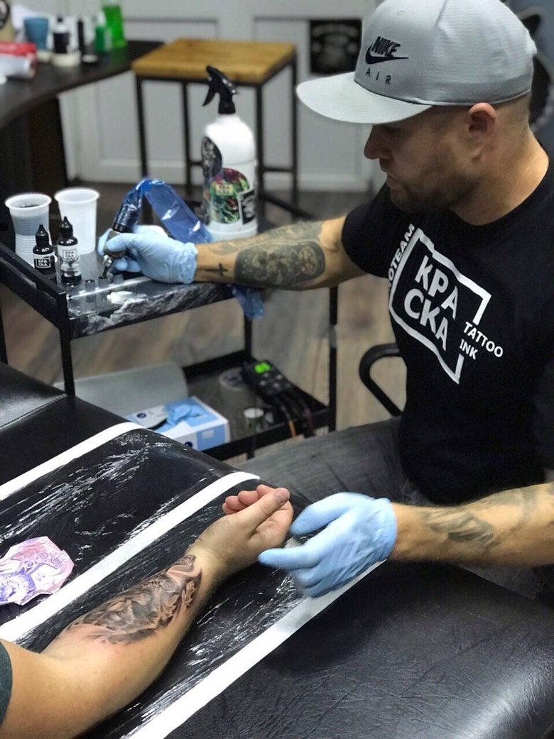
My name is Dmitry Zadorozhny, I'm a tattoo artist of ProTeam КРАСКА Tattoo ink, and people often ask me why did I choose КРАСКА (Kraska - it is Russian word meaning Paint) for my work, why it is better than other brands and so on. So I got the idea to write a short article, a little biographical, but with answers to all the questions about my choice.
I have been tattooing since 2013. During these 6 years I worked in different styles, but came to realism anyway. I like this style because of its complexity, in which I can realize my creative potential. One of the features of my work can be considered an attempt to combine colors that do not combine in principle.

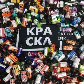
My acquaintance with КРАСКА began at the Donetsk tattoo festival, where someone presented me a small inks set from КРАСКА. Until that moment, I had never used it in my work, but like many others I used World Famous. I tried the set in the work and at the beginning I did not feel any noticeable difference between these paints. A little bit later I noticed that КРАСКА's cold shades are much better for me than WF.
An additional pleasant moment was nostalgia for those times when I painted with oil and acrylic and there was the Leningrad palette. The shades from this palette is very similar to КРАСКА's shades. It's a little bit muffled, but more natural. Without extra acidity of paints, as in wildlife. It is very pleasant to work with such shades.
This leg sleeve was the first work completely done with КРАСКА's inks.

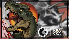
In general, in my work I use a wide palette of colors. For example, in the last work that I did in the Best of Day nomination at the 17th Moscow Tattoo Festival, I used: magenta, acid green, cornflower, eggplant, Aztec gold, sunflower, red viburnum, orange pumpkin, cold gray medium, malevich black premium and white winter. I tried to mix cold and warm shades gently, and everything were obtained as it should. On the top of the picture you can see a mix of green and blue shades, and whole work was done with such effect.

As for pigments, machines and other supplies, I think a good artist, having talented hands is dependent on the selected supplies far from 100%. In my opinion, the percentage is about this: 70% is the talent of an artist and 30% are supplies. And in the supplies I mean the inks, because machines - this is nonsense. If the artist’s hands grow from the right place, he can make a tattoo with almost any tattoo machine.
But with inks is a completely different story. When you are looking at picture and the palette, you must to understand which pigments need to use, how to combine them in order to achieve the desired result. КРАСКА is very convenient to work. It mixes excellent, does not dry out. Many brands have such a problem that when you work for a long time, then the ink in the cap can simply be covered with a dried film - it really annoy me sometimes. It turns out that they need to be constantly stirred throughout the entire process. But КРАСКА's ink are not dry.


And the color rendering itself, for example, the same black pigment from КРАСКА remains black after healing. In the same Intenza, for example, pigments do not give the black tint in the healed work that I would like to get. КРАСКА's black on the contrary becomes noble. Of course, it turns gray a little, but remains predictable, does not give a blueness and goes well with other shades of the palette. The same works performed by Eternal, after healing, faded quite strongly, the shades changed noticeably, and those that were done by КРАСКА remain attractive and do not lose color and contrast.


It is clear that my personal experience cannot be the ultimate truth. Someone does the wonderful works use World Famous, Fusion, and the Intenza and Eternal that I mentioned. But I made my choice in favor of КРАСКА, and I hope my explanations will help those who are now in search of the most suitable pigments for their work.


Comments (0)