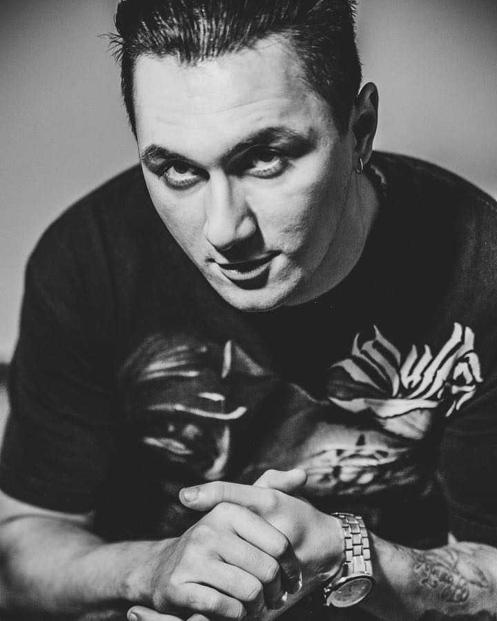
Today our guest is Alexander Akhmertdinov, a well-known Russian tattooist working in black and grey realism, a member of Pro Team КРАСКА Tattoo Ink.
This is another article in a series in which professionals lift the veil over their work techniques that help them stand out against the thousands of other tattooists and allow them to rightfully be called the TOP artists.
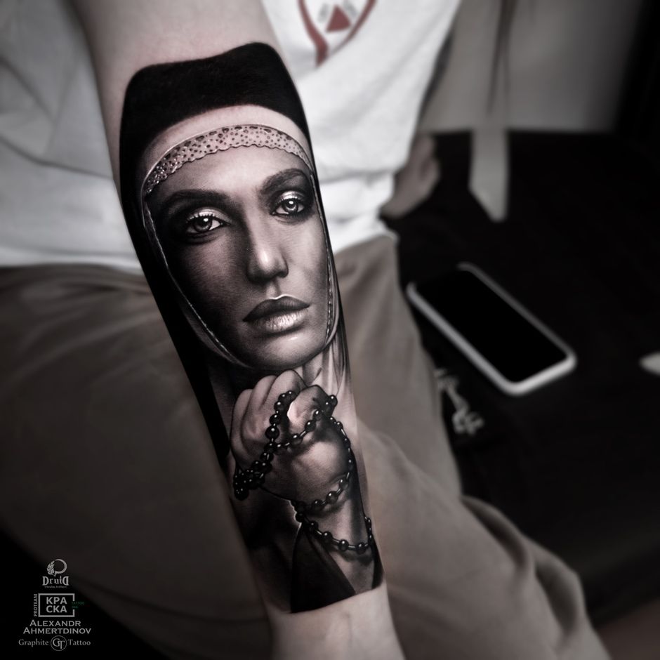
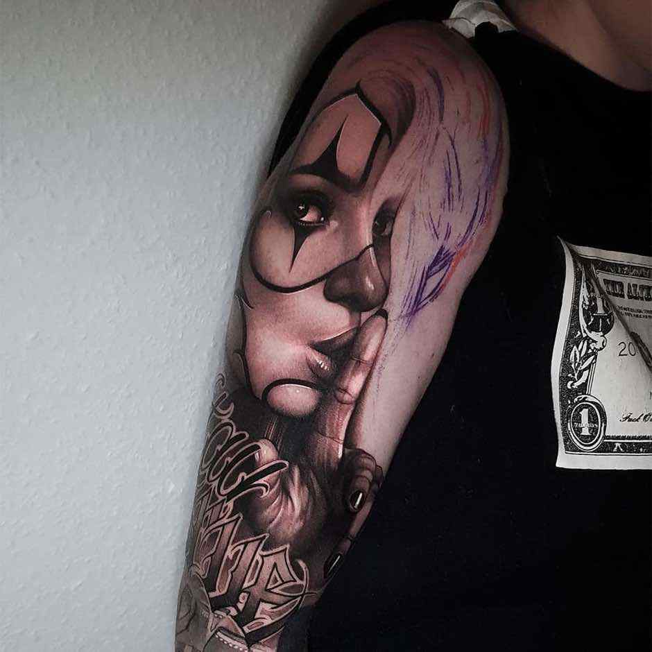
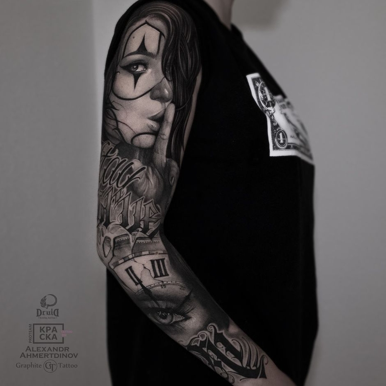
The main idea of this sleeve was to combine Chicano and Lettering styles. Apart from these styles, a realistic nun tattoo in black & grey is featured on the inside of the forearm.
According to the classics, each of my work begins with the development of sketches and general composition of elements. In this sleeve, all our work began with a nun. It was made first, and from it we already started building the future tattoo sleeve.
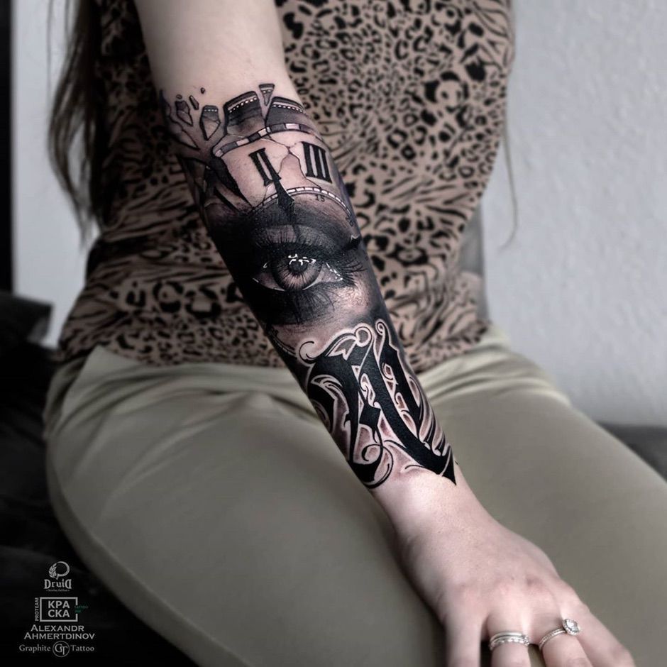
The lettering element I mentioned above is the letter «A» on the outside of the forearm - a symbolic association with my client's name. I drew the letter immediately on the skin and adding various stylistic details. I drew the rest of the composition and the sleeve sketches using the Pro Create application for Ipad.
In the arrangement of the elements on the sleeve, I was based on the anatomical features of the arm. For example, the inscription located in the middle of the project does not rigidly divide the tattoo in half, it is placed slightly obliquely along the muscle. The girl's face in Chicano is placed on the shoulder, cause this is a fairly static surface of the broad muscle. This arrangement will avoid unnecessary distortion of images when you move your hand.
For tattooing, I use the Cheyenne Thunder in a low speed mode, about 7000 - 7500 rpm. complete with Kwadron cartridges. As a paint I use Andrey Lukyanenko's author's set of greywashes by КРАСКА Tattoo Ink.
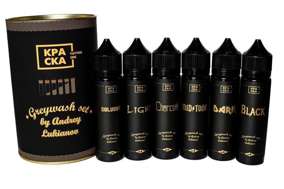
The choice of theКРАСКА Tattoo Ink pigments is primarily due to the fact that they always heal as it should, even if the pigment is not fully brought into the skin , everything will be equal during healing. I work in the spray technique, that is, as a printer, I go through the work from the bottom to top, from light tones to dark ones. The exception is white. I add it last when I finalize the work, so that there is no way to stain it with a darker paint.
This technique of layer-by-layer blending of shades eliminates situations when the artist unnecessarily darkens the image as a result of an error in mixing shades. In my case, I apply pigment layer-by-layer until the desired shade is obtained, and I always work from light to dark.
I would also want to note that in my works I often use contours, cause with them, the work retains its integrity much better even after years. I am not a supporter of hyperrealism and I believe that a tattoo should be primarily a tattoo. This is the image that a person will wear until the end of his life, which means that the main thing should be the durability of the work.
In the process, I always stop to look at the work from afar, in the mirror, under different lighting, and so on. This allows you to identify the need for additional details in the image or to notice some minor errors.
After the end of the session, I process the tattoo with oil and leave it for about 10-15 minutes so that excess paint and ichor come out of the wound. After that, it is enough to wipe the tattoo with a napkin in order to get a matte image, which is perfect for photographing.
After that a client go home. I also ask him to send a photo or come personaly to check the quality of the healed work. The need for a corrective session depends on the results of caring for a healing tattoo.
As a parting word to novice colleagues, I would like to advise you to draw as much as possible. With an artistic talent, but without developed drawing skills, it is possible only to copy, but not to create something unique, your own. Therefore, the more you paint, the better you will prick and you will never lose these skills.
I wish you all prosperity and creative success, see you!


/54.eb936d94.jpg)
Comments (0)